
The living-room chaos of Definitely Maybe, the strange little worlds built into the early single sleeves, the sharp Oasis logo that became instantly recognizable, the street scene of (What’s The Story) Morning Glory?, and the extravagant scale of Be Here Now all helped define what the band felt like before a note even played. A huge part of that identity came from Brian Cannon and Microdot, the design company he founded in Manchester in 1990.
An early connection that mattered
Cannon’s relationship with Oasis began before the band became a national obsession, which is one reason it mattered so much. He was not some distant art director brought in once the machine was already running. He was there early, around the same Manchester world that Noel Gallagher was moving through while working with Inspiral Carpets.
Their now-famous meeting has become part of Oasis folklore: Noel noticed Cannon, struck up a conversation, and made it clear that if his band ever got signed, he wanted Cannon to do the artwork. That detail tells you a lot about both men. Noel already understood that great bands needed a visual identity as well as great songs, and Cannon already had the kind of eye that stood out before Oasis had even taken off.
Building the look of Oasis
Once Oasis were signed, Cannon became central to how the band presented itself. Microdot helped create not just sleeves, but a whole world around Oasis. The logo evolved into something cleaner, sharper and more timeless. The covers did not feel like standard promotional packaging. They felt like extensions of the songs — visual companions to the swagger, melancholy, wit and ambition in Noel Gallagher’s writing.
This was not design happening in parallel to the music. It was part of the same project.
That closeness mattered. Cannon has often described the process as one built around conversation, usually with Noel, with ideas being discussed properly before a camera was lifted or a concept was finalised. Sometimes Noel would have a clear starting point, sometimes Cannon had room to invent, but the important thing was the trust between them.
The artwork was not being churned out by committee. It was being shaped with the same sort of intention that went into the records themselves. That is one reason the best Oasis sleeves never feel accidental or generic. They feel authored.
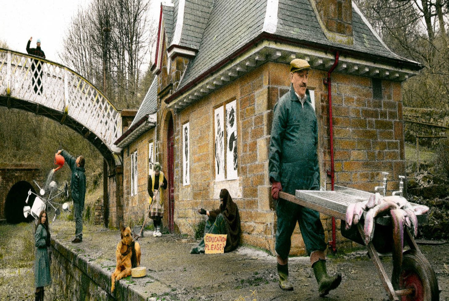
In need of education in the rain
You made no preparation
For my reputation once again
The sink is full of fishes
She's got dirty dishes on the brain
And my dog's been itchin'
Itchin' in the kitchen once again
More than sleeve design
What made Cannon and Microdot especially important is that they did not treat record sleeves as decoration. They treated them as storytelling. The Definitely Maybe cover is the clearest example. It looks casual at first glance, like a candid anti-band shot, but the image is carefully staged, packed with objects, references and atmosphere. It feels immediate and lived-in, but it is constructed with real thought.
That balance became one of Microdot’s great strengths: the sleeves looked spontaneous enough to feel alive, but deliberate enough to stay memorable.

Why so much 1990s artwork aged badly
And that is where Cannon’s work becomes more interesting than simple nostalgia. The 1990s produced a lot of great music, but not always great sleeve design. Plenty of covers from that era now look trapped inside the moment that made them: overworked, flat, gimmicky, or rooted in the first rush of digital manipulation in a way that has dated badly.
As the decade moved forward and digital tools became quicker and more available, a lot of artwork started to feel cheaper, faster and less physical. Ideas could be assembled more easily, but they often lost weight in the process. Some sleeves from that period now look like relics of software rather than records.
How Microdot stood apart
Microdot aged differently because Cannon resisted that disposable visual language. Even when the ideas were surreal or playful, they were usually built through practical methods — real locations, real props, real staging, real photography. The sleeves took time, and they looked like they took time.
That patience gave them texture, atmosphere and permanence. Where some 1990s artwork now feels trapped in the dawn of the digital era, Microdot’s work still feels tangible. It has depth. It has craft. And because of that, it has survived.
That practical approach is a big part of why the Oasis visual world remains so recognisable now. Microdot created a language that felt distinctly British without becoming narrow, witty without becoming novelty, and cinematic without losing its street-level edge. You can see it in the framing, in the use of real spaces, in the way each sleeve seems to imply a larger story.
The work felt imaginative, but never synthetic. It looked like a world you could step into.


A visual identity that matched the music
That mattered enormously for Oasis because the band themselves sat on a line between the everyday and the mythic. They sang about council-estate frustration, escape, arrogance, longing and self-belief, and Cannon’s sleeves reflected that same tension.
They made Oasis look grounded enough to belong to ordinary life, but large enough to feel iconic. The imagery helped turn the band into something beyond a collection of songs. It made them feel like a complete cultural presence.
By the time of (What’s The Story) Morning Glory?, Cannon and Microdot had refined that visual language into something unmistakable. Oasis were growing larger, the music was reaching further, and the artwork scaled up with them without losing character. Then came Be Here Now, where the grandiosity of the band’s moment was reflected in equally bold visual terms.
Even when Oasis moved into excess, Cannon understood how to make that excess legible. He was not just documenting the band’s rise; he was helping stage it.
Beyond Oasis
But the story does not stop with Oasis, and that is important. Brian Cannon is often remembered first as “the Oasis sleeve guy,” which is understandable, but too narrow. Through Microdot, he also worked with The Verve, Suede, Cast, Ash, Super Furry Animals and others, helping to shape the wider look of British guitar music in the 1990s.
In that sense, Cannon was not simply attached to one major band. He was part of a broader visual culture around Britpop and its neighbouring scenes. If Oasis were the loudest expression of that aesthetic, they were not the only one.
Why the work still lasts
What makes his work endure is that it still communicates instantly. Even now, decades later, the Microdot style carries a certain kind of authority. It signals thought, care, identity and atmosphere. It does not feel like packaging. It feels like authorship.
In an era where so much music imagery became quicker, flatter and easier to reproduce, Cannon’s work retained personality. That is why it still stands out. It does not just look good in hindsight; it looks built to last.
Conclusion
So Brian Cannon’s contribution to Oasis was bigger than sleeve design in the narrow sense. He helped create the visual grammar of the band. He translated Noel Gallagher’s instincts into images, gave Oasis a recognisable face, and protected them from looking cheap or disposable at exactly the moment when that could easily have happened.
Through Microdot, he gave the band a world as distinctive as the music itself.
If Oasis defined an era in sound, Brian Cannon helped define how that era looked. And while plenty of 1990s album covers now feel stranded in the first rush of digital design, Microdot’s work still feels alive — tactile, deliberate and unmistakably human. That is why it remains so recognisable now. It was never just about making sleeves. It was about building a visual language that could outlast the decade that produced it.


Comments
0 approvedNo comments yet. Be the first.
Leave a comment